
NCERT Solutions Class 9 Maths (Ganita Manjari Part II) Chapter 10 – How Quantities Combine: Understanding Data
Circle of Learning • New NCERT textbook "Ganita Manjari" Part II (2026-27) • Think and Reflect, in-text questions, Exercise Sets 10.1–10.5, End-of-Chapter Exercises – step-by-step solutions
Think and Reflect (Average of Averages)
Why did Method 1 not work for the badminton group?
Method 1 averages the two group averages (165.5 and 149.33) as if both groups were the same size. There are 8 seniors but only 3 juniors, so the seniors' average should count more. The correct average weights each group by its size: (165.5 × 8 + 149.33 × 3)/11 = 1772/11 ≈ 161.09 cm.
Why does Method 1 work for Jaspreet's cycling? Each week has the same number of days (5), so each weekly average carries the same weight: (5a + 5b + 5c)/15 = (a + b + c)/3. Simply averaging the averages works only when the groups are of equal size.
Exercise Set 10.1
Section A (30 students) averages 72, Section B (25 students) averages 76. Combined average?
Answer
(72 × 30 + 76 × 25)/(30 + 25) = (2160 + 1900)/55 = 4060/55 ≈ 73.82.
(It is closer to 72 because Section A is larger.)
Equal quantities of fertilisers with 1/10, 9/50 and 3/60 nitrogen are mixed. Fraction of nitrogen?
Answer
Equal quantities, so take the simple average: (1/10 + 9/50 + 3/60)/3 = (0.10 + 0.18 + 0.05)/3 = 0.33/3 = 0.11 = 11/100.
9 units at 12 varṇa, 5 units at 10 varṇa, 17 units at 11 varṇa. Purity of the combined gold?
Answer
Weighted mean = (9 × 12 + 5 × 10 + 17 × 11)/(9 + 5 + 17) = (108 + 50 + 187)/31 = 345/31 = 11 4/31 ≈ 11.13 varṇa.
Average daily rainfall: May 3.5 mm, June 10 mm, July 8.7 mm. Expression for the combined average.
Answer
May and July have 31 days and June has 30, so the weights are the numbers of days:
Combined average = (3.5 × 31 + 10 × 30 + 8.7 × 31)/(31 + 30 + 31) = 678.2/92 ≈ 7.37 mm per day.
(i) (100 × 5% + 200 × 10% + 300 × 15%)/600 = (5 + 20 + 45)/600 mL = 70/600 ≈ 11.67%
(ii) (300 × 5% + 200 × 10% + 100 × 15%)/600 = (15 + 20 + 15)/600 = 50/600 ≈ 8.33%
Answer
(The same three concentrations give different mixtures: the larger volume pulls the result towards its own concentration.)
Exercise Set 10.2
Savitri: 35/50 (internals), 44/60 (project), 80/100 (final); weights 3 : 4 : 5. Which expression(s) give her annual percentage?
Answer
First turn each mark into a fraction or percentage of its own maximum, then take the weighted mean. So (iii) and (iv) are correct; they are the same calculation.
(i) is wrong: it mixes raw marks with different maximums (50, 60, 100).
(ii) is wrong: it divides every mark by 100 although the maximums are 50 and 60.
Value: 35/50 = 70%, 44/60 ≈ 73.33%, 80/100 = 80%. Annual score = (70 × 3 + 73.33 × 4 + 80 × 5)/12 ≈ 75.28%.
Exercise Set 10.3
Profit = 30% of 8000 + 50% of 1000 = 2400 + 500 = ₹2900 on total sales of ₹9000.
Answer
Profit % = 2900/9000 × 100 ≈ 32.22% (a weighted mean of 30% and 50%, weighted by sales).
Guess: slightly above 44.5 km, since one more day at 55 km has only a small weight (1 out of 21).
Answer
(44.5 × 20 + 55)/21 = (890 + 55)/21 = 945/21 = 45 km.
Salt = 5% of 600 = 30 mL; sugar = 8% of 300 = 24 mL; total volume = 900 mL.
Answer
Salt = 30/900 ≈ 3.33%, sugar = 24/900 ≈ 2.67%. Answer: (v).
Spice in 10 L of pani = 8% of 10 = 0.8 L. The new concentration should be ¾ × 8% = 6%.
Answer
0.8/(10 + w) = 0.06
⇒ 10 + w = 13.33
⇒ w = 10/3 ≈ 3.33 litres of water.
(i) Compared with Rashi, Keerthi has 5 fewer marks in strength (weight 4), the same in flexibility, and 5 more in agility (weight 6). The gain carries more weight than the loss, so Keerthi's total is more.
Answer
(ii) Rashi: (60 × 4 + 65 × 5 + 70 × 6)/15 = 985/15 ≈ 65.67; Keerthi: (55 × 4 + 65 × 5 + 75 × 6)/15 = 995/15 ≈ 66.33.
Average of each metric over the 10 customers:
Answer
Food = (5×5 + 3×4 + 2×3)/10 = 43/10 = 4.3
Ambience = (4×4 + 5×3 + 1×2)/10 = 33/10 = 3.3
Service = (1×5 + 2×4 + 2×3 + 4×2 + 1×1)/10 = 28/10 = 2.8
Combined rating = (6 × 4.3 + 5 × 3.3 + 4 × 2.8)/15 = (25.8 + 16.5 + 11.2)/15 = 53.5/15 ≈ 3.57.
Without calculation: the midpoint of 16.5 and 13.8 is 15.15. The overall average 14.925 is closer to the female average (13.8), so there are more female langurs.
Answer
(i) Let x males and y females. The correct expression is (a) (16.5x + 13.8y)/(x + y) = 14.925. Since x + y = 60, (b) (16.5x + 13.8y)/60 = 14.925 is also correct. (c) and (d) are wrong.
(ii) 16.5x + 13.8(60 − x) = 14.925 × 60 = 895.5
⇒ 2.7x = 67.5
⇒ x = 25 males (and 35 females).
(iii) Total female weight = 13.8 × 35 = 483 kg. New average = (483 + 15.2)/36 = 498.2/36 ≈ 13.84 kg.
(iv) Total male weight = 16.5 × 25 = 412.5 kg. After releasing 16.9 + 16.1 = 33 kg: 379.5/23 = 16.5 kg – unchanged, because the two langurs released also averaged 16.5 kg.
(v) One male loses 1 kg: the total drops by 1, so the average drops by 1/23. New average = 378.5/23 ≈ 16.46 kg.
(i) Salinity = (1 × 34% + 2 × 0.001%)/3 = 34.002%/3 ≈ 11.33%.
(ii) Yes – groundwater's 0.01% lies between 0.001% and 34%, and a mixture's salinity can take any value between the two. Let w litres of purified water be added:
Answer
(34 + 0.001w)/(1 + w) = 0.01
⇒ 34 + 0.001w = 0.01 + 0.01w
⇒ 0.009w = 33.99
⇒ w ≈ 3777 litres.
(iii) No. The salinity of a mixture always lies between the salinities of its parts. Both the Dead Sea water (34%) and groundwater (0.01%) are saltier than 0.001%, so no amount of groundwater can bring the mixture down to 0.001%.
In-text Questions (Fig. 10.1 and 10.2 – Family Expenditure)
Totals from Table 10.2: Family A = ₹8425, Family B = ₹7286, Family C = ₹7040.
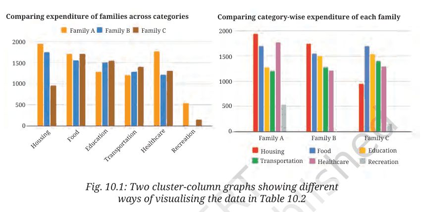
1. Least on housing: Family C (₹950).
2. Most on healthcare: Family A (₹1770).
3. Family A on education: about ₹1300 (₹1280).
4. Family B spent most on housing (₹1750).
5. Family A spent more on healthcare (₹1770) than on food (₹1700).
6. Least overall: Family C (₹7040).
7. Family C overall: about ₹7000.
8. Family C's share on housing: 950/7040 ≈ 13.5%.
Smallest share on healthcare (pie or 100% bar): Family B (16.6%), compared with A 21.0% and C 18.5%.
Example 7 (electricity): In 2025 the total is 220 + 800 + 460 + 520 = 2000 units: lighting 11%, cooling 40%, kitchen appliances 23%, other appliances 26%. Total use doubled. Lighting fell even in actual units (efficient LED lights), while cooling's share jumped from 30% to 40%, showing a big rise in the use of fans, coolers and ACs.
Exercise Set 10.4
(i) 14,234 is the total number of animal species (all classes together) on the IUCN Red List in 2019 – the height of the whole stacked column.
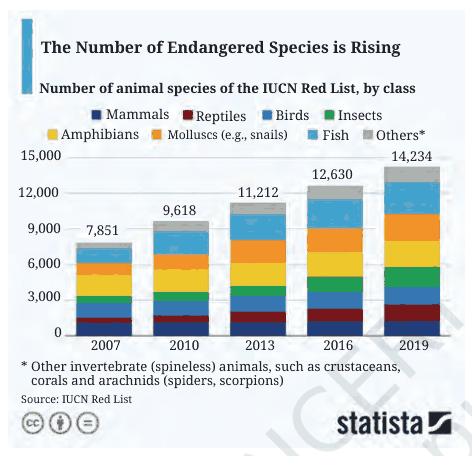
(ii) In 2016, the reptile segment (dark red) is about 1,000 species (roughly 900–1,100, read from the chart).
(iii) Mammals and birds grew relatively little (each by only a few hundred species) between 2007 and 2019, while fish, molluscs and insects grew a lot.
Answer
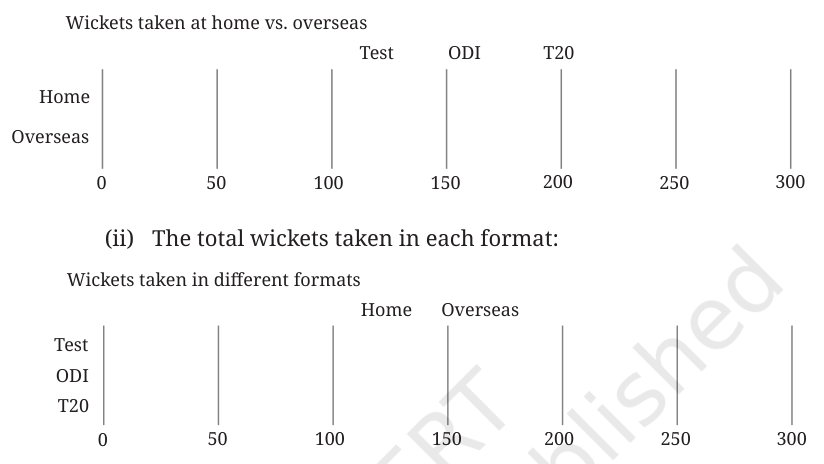
(i) Home vs overseas:
Answer
Home bar: Test 62
⇒ ODI 100
⇒ T20 32; total 194.
Overseas bar: Test 172
⇒ ODI 49
⇒ T20 71; total 292.
(ii) By format:
Test bar: Home 62 + Overseas 172 = 234.
ODI bar: Home 100 + Overseas 49 = 149.
T20 bar: Home 32 + Overseas 71 = 103.
(Draw each segment to the given length on the 0–300 scale, one after another.)
Think and Reflect (Stacked and 100% Stacked Bars)
1. A stacked bar shows actual amounts, so it can compare totals and actual parts. A 100% stacked bar shows only shares (fractions of each total). It cannot tell us actual numbers or which total is bigger.
2. Yes. From a stacked bar we know each part and the total, so we can work out every percentage.
3. No, not unless we also know each total. Many different totals give the same 100% bar.
4. Stacked bar: compare totals, and amounts of parts (most easily the first part). 100% stacked bar: compare the share of each part within a group and the shares across groups (e.g. which family spends the largest fraction on food), but not actual amounts.
Think and Reflect (Time Use, Fig. 10.5 and 10.6)
1. Interesting points: Everyone spends about a third of the day sleeping and about 26% (about 6 h) on leisure, social activity and travel, while the elderly spend more on leisure (33%). Children spend 22% (about 5 h) learning. Adults (25–59) spend the most time on paid work (14%) and unpaid work and care (15%).
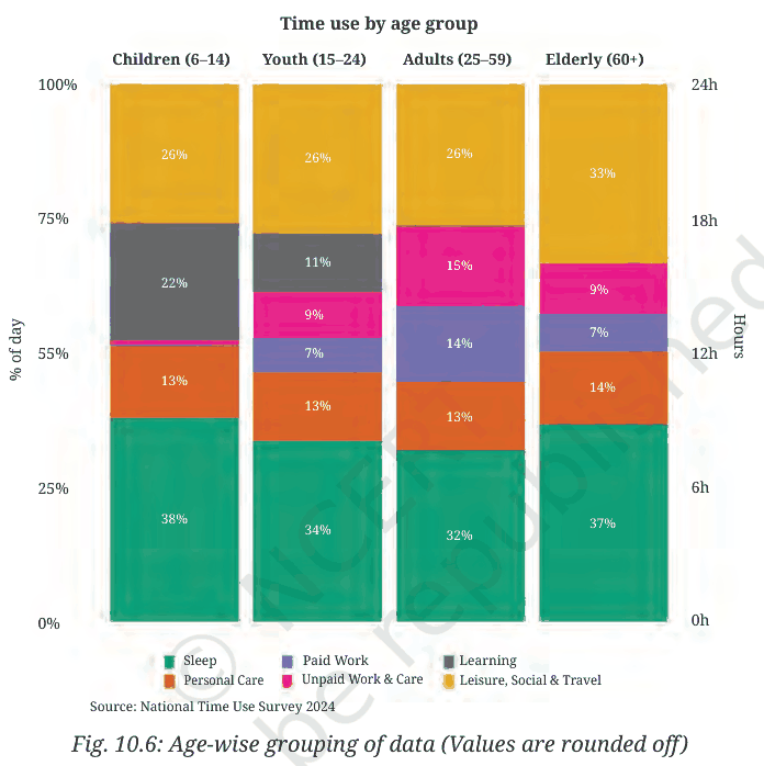
2. Sleep trend: Sleep falls from children (38%, about 9 h) to youth (34%) to adults (32%, under 8 h), as we saw last year (we need less sleep as we grow older). It rises again for the elderly (37%), perhaps because they rest more after retirement, and because this is "time in bed" including rest.
3. Why learning falls for 15–24: Many young people finish school, and some stop studying after Class 10 or 12 to start work. The 15–24 group includes both students and working youth, so the average learning time drops (to 11%) while paid work and unpaid work appear.
4. Paid vs unpaid work for adults: On average, yes – about 14% and 15% (roughly 3.5 hours each). But this is an average over all adults. In reality many men do mostly paid work and many women do mostly unpaid household and care work. The average hides this difference, which could be seen by splitting the data by gender.
Strip activity: Yes – if we gather all the small pieces of each activity in a day's strip into one block, we get one 100% stacked bar for that person, like one column of Fig. 10.6 (the total is always 24 hours).
Exercise Set 10.5
(i) A reasonable guess for Sahana (student): lying down 9 h, sitting 9 h (school, study), standing/moving around 6 h (total 24 h). (Answers may vary.)
Answer
(ii) Julie sits 10 hours, lies down 8 and moves 6, so she probably has a desk job – e.g. an office worker, bank clerk, software engineer, accountant or bus driver. (Answers may vary.)
(iii) Percentages for the 100% stacked bars (each of 24 h):
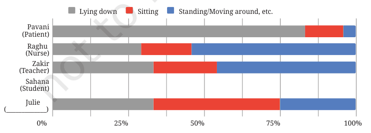
Person | Lying down | Sitting | Standing/moving |
Pavani (patient) | 83.3% | 12.5% | 4.2% |
Raghu (nurse) | 29.2% | 16.7% | 54.2% |
Zakir (teacher) | 33.3% | 25% | 41.7% |
Sahana (student, sample) | 37.5% | 37.5% | 25% |
Julie (office worker) | 33.3% | 41.7% | 25% |
Think and Reflect (Body-state Bars)
1. Broadly similar – most teachers stand a lot while teaching – but the exact lengths would change with the person (e.g. a teacher who sits while teaching or travels a long way).
2. Yes, probably. Weekends usually have more lying down or sitting (rest, TV) and less standing at work, so averages over 7 days would shift.
3. Raghu's bar (mostly standing/moving) could also fit a waiter, shopkeeper, farmer or traffic police officer; Julie's could fit a driver or call-centre worker; Pavani's could fit anyone who is ill or bedridden.
End-of-Chapter Exercises
(i) Run rate after 2 overs = (6 + 12)/2 = 9.
(ii) Runs after 19 overs = 6 × 19 = 114. After 20 overs: (114 + 12)/20 = 126/20 = 6.3.
Answer
Working together: pool all the prices – add up every price collected and divide by the total number of prices (23). Equivalently, each friend reports both their average and their count.
Answer
(i) Yusuf collected 6 prices, Srikanth 4, Kashvi 5, Prasanna 4, Gracy 4.
Combined average = (6a_y + 4a_s + 5a_k + 4a_p + 4a_g)/23.
(ii) There are 13 nylon and 10 feather prices. Average = (13a_n + 10a_f)/23.
Yes, both expressions give the same value, because each is (sum of all 23 prices)/23. The actual value is 4063/23 ≈ ₹176.65.
(i) (25 × 150 + 10 × 30)/35 = (3750 + 300)/35 = 4050/35 ≈ ₹115.71.
(ii) Let k shares be bought: (5 × 150 + 30k)/(5 + k) = 70 ⇒ 750 + 30k = 350 + 70k ⇒ 40k = 400 ⇒ k = 10 shares.
Answer
Mean depth (weighted by lengths) = (4 × 9 + 5 × 7 + 6 × 7 + 7 × 3 + 8 × 2)/30 = (36 + 35 + 42 + 21 + 16)/30 = 150/30 = 5 hastas.
Answer
New average price per gram (in ₹ thousand) after each purchase, starting from 1 g at 15k:
Answer
(i) (15 + 30)/2 = 22.5k (ii) (15 + 60)/3 = 25k (iii) (15 + 10)/2 = 12.5k (iv) (15 + 100)/11 ≈ 10.45k (v) (15 + 15)/1.5 = 20k (vi) (15 + 7.5)/1.5 = 15k (unchanged)
On the number line, each point lies between 15 and the new price, closer to whichever side has more grams.
The weighted average does not change. With every weight doubled:
Answer
(2w₁x₁ + 2w₂x₂ + … + 2wₙxₙ)/(2w₁ + 2w₂ + … + 2wₙ) = 2(w₁x₁ + … + wₙxₙ)/[2(w₁ + … + wₙ)] = (w₁x₁ + … + wₙxₙ)/(w₁ + … + wₙ).
Only the ratio of the weights matters (3 : 2 : 5 is the same as 6 : 4 : 10).
(Values read from the graph are approximate.)
(i) In 2003 about 10,000 objects were orbiting Earth. This doubled to about 20,000 around 2021.
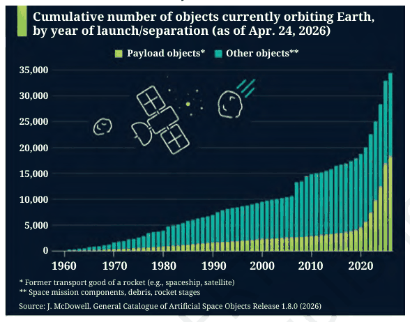
(ii) In 2025: total ≈ 33,000; payload objects ≈ 16,800 (about 51%), other objects ≈ 16,200 (about 49%).
Answer
(iii) Payload objects grew slowly and steadily for about 60 years, then shot up after about 2019 (thousands of small satellites launched in large constellations). Other objects (debris, rocket stages) grew steadily, with sudden jumps around 2007–2009 (debris from collisions and anti-satellite tests), and more slowly after that. For decades payloads were only about 20–25% of all objects, but their share has risen sharply in recent years to about half, so the share of other objects has fallen to about half.
(i) The map shows percentages of schools, not numbers.
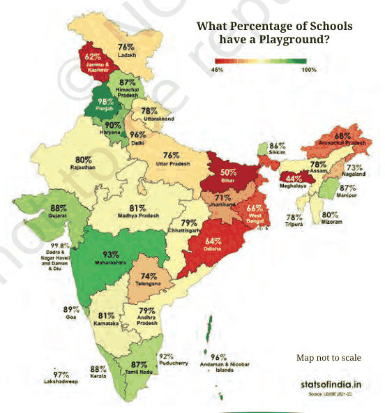
(a) Cannot be inferred – Haryana has a higher percentage (90% vs 78%), but we don't know how many schools each state has.
(b) Correct – 68% ≈ 2/3, so about 2 in 3 schools in Arunachal Pradesh have a playground.
(c) Cannot be inferred – Punjab has a high percentage (98%), not necessarily the highest number. (Dadra & Nagar Haveli and Daman & Diu has an even higher percentage, 99.8%.)
(d) Correct – if M > T, then 0.93M > 0.74T, so Maharashtra has more schools with playgrounds.
(ii) No. The national percentage is a weighted average of the state percentages, so we need the number of schools in each state/UT (the weights).
Answer
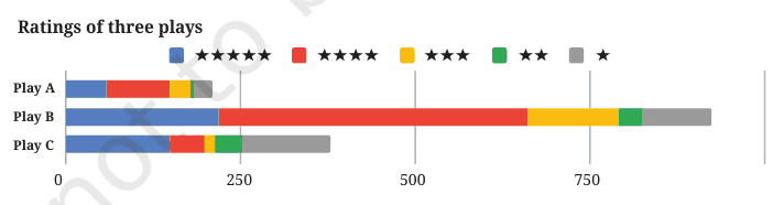
(i) From the 100% chart, Play A or Play B look best: each has about 70% of ratings at 4–5 stars and few 1-star ratings. Play C has the largest share of 5-star ratings (about 40%), but about a third of its ratings are 1-star, so it is more "love it or hate it".
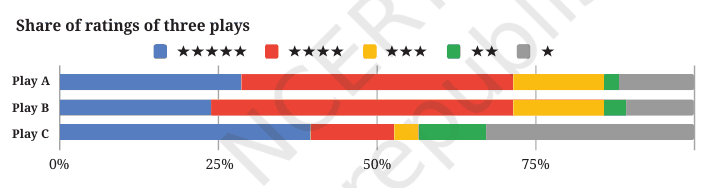
Answer
(ii) The stacked chart shows that Play A has very few ratings (well under 100), Play B has about 900 and Play C about 380. Play B's good ratings come from many more viewers, so they are more reliable. Many people would now choose Play B. (Discussion answer – the point is that shares alone can mislead without the number of ratings.)
Total times: Athlete 1 = 9 h 23 min, Athlete 2 = 9 h 50 min, Athlete 3 = 11 h 07 min.
(i) A stacked bar chart is more suitable, because the race is decided by the total time, which a stacked bar shows directly while still showing each segment.
(ii) From a 100% stacked bar chart:
(a) Cannot be answered – the totals are not shown.
(b) Can be answered – cycling is 5 h of 9 h 23 min ≈ 0.53, i.e. a little over half.
(c) Cannot be answered – only shares are shown, not actual running times. (From the table: Athlete 3, 3 h 50 min.)
Answer
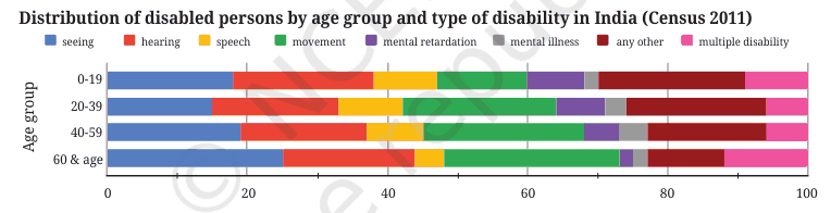
Noticing: Seeing disability is the most common type in every age group, and its share is highest for 60+ (about 25%). Movement disability's share grows with age (about 13% at 0–19 to about 25% at 60+). Mental retardation's share is largest for 0–19 and shrinks with age. "Any other" is a large share for younger groups. Multiple disability is a larger share in the oldest and youngest groups. Hearing stays around 17–20% in all groups.
Answer
Wondering: How many people are in each age group? (The chart only gives percentages.) Why does movement disability rise with age – ageing, accidents, arthritis? What is in "any other"? How would the 2021 data compare?
Question 12 (Individual project)
Sample for (i): Me – lying 9 h, sitting 9 h, moving 6 h; Mother – lying 7 h, sitting 5 h, moving 12 h; Father – lying 7 h, sitting 10 h, moving 7 h. Draw one stacked bar per person (each totalling 24 h).
For (ii): choose categories (food, rent, education, transport, health, others), record 3 months, convert each month's amounts to percentages of that month's total, and draw one 100% bar per month. Then compare how the shares change. (Personal project – your data will differ.)
Question 13 (Group project)
Example – bus travel: aspects punctuality, cleanliness, safety, crowding, staff behaviour, fare; weights 3 : 2 : 3 : 2 : 1 : 1 (safety and punctuality matter most). Each person's score = Σ(weight × rating)/Σweights; the overall score is the average of the individual scores. Draw a 100% stacked bar of the share of 1–5 ratings for each aspect, and note what the scheme captures (key priorities) and misses (e.g. route frequency).
Question 14 (Whole-class project)
The average age of all families must be weighted by family size: each student gives (average age of family, number of members). Overall average = Σ(family average × family size)/Σ(family size), i.e. the total of everyone's ages divided by the total number of people. Simply averaging the family averages would be wrong unless all families were the same size.
Question 15*
Adding the same constant to every weight usually changes the weighted average and pulls it towards the ordinary (unweighted) mean. Example: values 10 and 20 with weights 1 and 3 give (10 + 60)/4 = 17.5; with weights 2 and 4 they give (20 + 80)/6 ≈ 16.67, moving towards the simple mean 15.
Algebra: the new average = (Σwᵢxᵢ + Σxᵢ)/(Σwᵢ + n), which is a weighted mix of the old weighted mean (weight Σwᵢ) and the simple mean Σxᵢ/n (weight n). It is unchanged only if the weighted mean already equals the simple mean (e.g. all weights equal). The bigger the constant, the closer the result gets to the simple mean.
Question 16*
The shares must always add up to 100%.
(i) All three shares decreasing – impossible (the total would fall below 100%).
(ii) All three shares increasing – impossible.
(iii) All shares the same – possible (e.g. every population falls by 20%).
(iv) Cows ↓, sheep ↑, chickens same – possible. Example: 60, 25, 15 (of 100) become 44, 24, 12 (of 80) = 55%, 30%, 15%.
(v) Cows ↑, sheep ↑, chickens ↓ – possible. Example: 60, 25, 15 become 58, 23, 9 (of 90) ≈ 64.4%, 25.6%, 10%.
Answer: (iii), (iv) and (v).
Extra Practice Questions
1. 40 boys average 52 kg and 20 girls average 46 kg. Find the class average. (40 × 52 + 20 × 46)/60 = 3000/60 = 50 kg
2. 2 L of 10% sugar syrup is mixed with 3 L of 20% syrup. Concentration? (0.2 + 0.6)/5 = 16%
3. Marks 80, 70, 90 with weights 1 : 2 : 2. Weighted mean? (80 + 140 + 180)/5 = 80